Webmasters: Any [non-adult-content] site that wishes to link to the Cobra
Information Site may do so, provided that the link is directly to the homepage, at http://Cobras.org. Links to other pages are by
permission, please. Herp related sites are encouraged to link, and I maintain a page of recip links. Just tell me in e-mail that you are linking to my site, and what URL
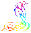
you would like me to link to. If a graphic is desired for link purposes, the cobra icon
below should be used for this purpose. This site will not
entertain links to or from adult-content sites!
Have any questions on how I did something on my site? I'm still learning the tricks of
HTML myself, so I encourage an exchange of ideas. I'd be happy to explain
anything I've done. I even have code fragments pre-made for the
Java Scripts. Needless to say, "view source" is probably the greatest trick
there is for this, but what the heck...write anyway. I value the opinions of others, so
let me know what I can do to improve my site. I'll be happy to give you any input I can in
return. Don't forget to tell me what browser you're viewing my site with, and how you
ended up here.
Lastly, please keep in mind that the photoimages on this site are mine, and are
Copyrighted. All you need do is ask, and I may give
permission to use 'em. If you don't ask, and I see my babies on your site, it gets ugly. I
work hard to create my images, and don't get paid when they are userped. I don't like my
stuff floating around USENET, as I'm sure you wouldn't either, so just don't do it please.
'Nuff said. Have fun....surf on!
Some tricks I've learned...
Dumb webmaster hint of the year: I can't believe I still get e-mail and see postings
in newsgroups from people with web sites that do not include their URL! I hope I
don't insult anyone out there with this one, but heelooooooo, McFly...the more you put
your URL in front of the surfing public, the better chance they'll visit!
Want a really kewl e-mail address or domain name? Check out Mailbank.com ... they
have 12,000 domain names available, and any e-mail address within those domains you can
think of. Just think...you too can have a domain name as kewl as mine...hehehe!
Another way to get added exposure for your site is to add butter up the webmasters of the
sites that get a few hundred thousand hits a month (duh). Short of direct transfers from
your First Virtual account, the best way to do this is to place
subtle "advertisements" for those you like on your site in the form of links,
then tell them about it. EXAMPLE: I use Infoseek every time I search 'n surf. I like
them. I've told them so in e-mail, and put their entire search interface on my site. They
must like me now too, because my little site come up tops on any search using "cobra,
snakes" (or any of my other keywords). Try to find your site...not the same result?
Hmmm....By using an image as you page BACKGROUND, then setting a complimentary BGROUND
color, you not only get a colorful page load until the image shows up, but the borders of
your tables will be colored as well, making for a nicer effect than the standard gray
borders on most tables.
As more and more browsers become HTML 4.0 capable, small things like text colors, odd
sizes, table detail like row colors and such become a reality. This takes away the need
for cheesy tricks like BLINK and BIG to emphasize text.
If server space is an issue (isn't it always) then consider converting all of your
non-animated image files to JPG compressed from GIF. JPG files take up as much as 20% as
the same GIF. Try these setting for the best results: 80% compression, progressive (so it
loads immediately, then "clears up" as the image fills in). This allows the
reader to see the whole page right away, and begin to experience you page before the
images have loaded completely. This can also be done with interlaced GIF's, but they take
even more server space. Keep in mind that not all browsers support JPG's yet, so any
really crucial images, like logos, should remain GIF until everyone catches up.
Animated GIF's really catch the viewers eyes. With GIF Construction set, you can easily
make moving text banners, animated image transitions and animate a boring static image.
It's really quite easy if you use the animation wizard, read the help file a little, and
play with it till you get the effect your looking for. Just be careful of what I call
"Vegas Syndrome" where there's so many animations in a single screen that the
eye doesn't know where to go. (I know I'm guilty of this one too, but I just love some of
those little moving babies.)
Rather than creating pages 8 feet long that the viewer has to scroll for 5 minutes, break
up those monsters into single or double screen length pages. They'll load faster, and keep
the viewer doing something....which is why they're here, right?
Disagree with any of these? Have any other tips that should be here? Let me know!